Plate 30
Why Your Average Latency Graph Is Lying (p50 / p95 / p99 Playbook)
Average latency hides tail pain. Learn when mean lies, how p50/p95/p99 work, why averaging quantiles fails, and how Prometheus histograms fix aggregation.
Aditya Challa11 min read
Intro — what this post promises
Your Grafana panel says average request duration: 57 ms. The SLO meeting is calm. Slack is not: a minority of customers report multi-second hangs.
Both can be true. The mean is a single number. User pain lives in the shape of the latency distribution — especially the tail.
This is a diagnostic playbook for that lie:
- When the mean misleads (and when it is still useful).
- What p50 / p95 / p99 actually mean in plain language.
- The aggregation footgun: averaging percentiles across pods.
- How to instrument and query this correctly with Prometheus histograms (classic and native), with citations to real docs.
- A dashboard checklist that complements — does not rewrite — ShopperCove’s existing “how to read monitoring graphs” posts.
Those graph posts stay the place for golden-signal literacy. This post zooms into percentiles vs mean, histograms, and wrong aggregation. Link them; do not merge content.
Internal reading:
Lab honesty: Critical mean / percentile / avg-of-p99 tables below are from a local histogram lab (not Grafana) run on 29 Sep 2026 IST — see the tables in this post. Docker/Prometheus was unavailable on the lab box, so numbers are seeded numpy samples + classic histogram_quantile interpolation (not a live Prom scrape). Grafana screenshots and a native-histogram production scrape are optional follow-ups.
The mean is not “the latency users feel”
A tiny thought experiment
Suppose 100 requests in a window:
| Count | Latency |
|---|---|
| 95 | 20 ms |
| 4 | 100 ms |
| 1 | 5 000 ms |
- Mean = (95×20 + 4×100 + 5000) / 100 = 73.0 ms (lab-verified arithmetic; earlier “≈74” was a slip)
- p50 (median) = 20 ms
- Tail pain: one 5 000 ms sample is enough that a “p99 < 300 ms” SLO fails for users even while the mean looks fine. (numpy linear interpolation on this tiny N softens p95/p99 toward mid values; with real traffic volume the fat tail still shows up at p99 — see lab table below.)
If your alert is “mean > 100 ms,” you sleep. If your SLO is “p99 < 300 ms,” you page. Same data; different truth.
Lab-measured skewed series (same lesson, 10 000 requests)
Method: local histogram lab (not Grafana). Seed 20260929. Pod A healthy n=8000; pod B sick canary n=2000; merge = concatenate samples. Exact percentiles via numpy; also classic Prom-style histogram_quantile on buckets le ∈ {5ms…10s,+Inf}. Commands and raw outputs are archived in ShopperCove lab notes for this post.
| Series | n | mean | p50 | p95 | p99 |
|---|---|---|---|---|---|
| Pod A (healthy) | 8 000 | 26.4 ms | 20.1 ms | 36.8 ms | 117.5 ms |
| Pod B (sick canary) | 2 000 | 180.9 ms | 22.9 ms | 286.8 ms | 4389.6 ms |
| Merged service (exact) | 10 000 | 57.3 ms | 20.6 ms | 42.0 ms | 1156.9 ms |
Merged histogram_quantile | 10 000 | — | 20.3 ms | 49.2 ms | 1235.3 ms |
Mean 57 ms and p95 42 ms look calm. Merged p99 ≈ 1.16 s (histogram estimate ≈ 1.24 s) would breach a 300 ms p99 SLO. That is the optimistic-mean lie with real numbers.
The mean is still useful for capacity and cost (total work ≈ rate × mean). It is a weak user-experience SLI when the distribution is skewed — and latency almost always is.
Two opposite lies the average tells
| Lie | What the graph shows | What users feel |
|---|---|---|
| Optimistic mean | Low average; rare disasters diluted | Tail users furious |
| Pessimistic mean | One pathological spike pulls the average up | Most users fine; you over-react |
Percentiles do not remove judgment — they make the judgment match the question (“how bad is it for the slowest X%?”).
Percentiles without the jargon fog
Definitions you can say in a standup
- p50: half of requests were faster than this; half slower. Close to “typical” when the distribution is not multimodal.
- p95: 95% of requests were at or below this latency; 5% were slower.
- p99: 99% at or below; 1% slower. On high QPS, 1% is still many humans.
Prometheus talks about φ-quantiles where 0 ≤ φ ≤ 1 (0.95 = p95). See Histograms and summaries.
Percentile of what window?
A percentile is meaningless without:
- Which observations (success only? include errors? which route?)
- Which time window (last 5m rate vs instant gauge)
- Which aggregation key (per pod vs per service)
Changing any of the three changes the number. Dashboards that hide the window in a tiny legend cause false fights in postmortems.
The aggregation footgun — never average averages of percentiles
This is the mistake that makes multi-replica services look artificially healthy or weirdly unstable.
Why avg(p99) is statistically nonsense
If pod A’s p99 is 50 ms and pod B’s p99 is 500 ms, (50+500)/2 = 275 ms is not “the service p99.” You threw away the distributions. Prometheus’s own docs call out that aggregating precomputed summary quantiles “rarely makes sense,” and that averaging them “yields statistically nonsensical values.”
Bad:
Good (histogram — native):
Good (classic histogram — note le):
Source: Prometheus — Histograms and summaries.
Lab proof — avg(p99) vs merged quantile (2 series)
Same dataset as the table above (Pod A + Pod B):
| Aggregation | Resulting “p99” | vs true merged exact p99 (1156.9 ms) |
|---|---|---|
Unweighted avg(podA_p99, podB_p99) | 2253.6 ms | +1096.6 ms (overstates) |
| n-weighted average of the two p99s | 971.9 ms | −185.0 ms (understates) |
| Merged exact p99 | 1156.9 ms | 0 (truth for this sample) |
histogram_quantile(0.99) on summed buckets | 1235.3 ms | +78.4 ms (bucket interpolation) |
Averaging quantiles is not “approximately right.” Unweighted avg overshot by more than a second; weighting by request count still missed. Only merging the distributions (raw samples or histogram buckets) recovers a coherent service-level p99.
Same footgun for means of means across uneven pods
Even for averages, weight by request count:
Not avg(rate(sum)/rate(count)) across instances without care — imbalance hides hot pods. Native histograms also expose histogram_avg(rate(...)) helpers; see the same docs page and Metric types.
Histograms vs summaries — pick for the question you will ask later
Prometheus supports summaries (client computes quantiles) and histograms (buckets; server computes quantiles). Native histograms (and NHCB ingestion of classic histograms) are the modern preference when available.
| Need | Prefer | Avoid |
|---|---|---|
| Aggregate across replicas / shards | Histogram (native > classic) | Summary quantiles |
| Change φ or window later in PromQL | Histogram | Summary (fixed at instrumentation) |
| Ultra-precise φ on a single process, no merge | Summary can shine | — |
| Heatmaps over time | Higher-res native histograms | Ultra-coarse classic buckets |
Rules of thumb from Prometheus docs:
- Prefer native histograms with resolution matching accuracy needs.
- Else classic histograms with buckets around SLO thresholds.
- Summaries only when aggregation is not needed.
Further reading: Native Histograms spec.
Bucket layout still matters for classic histograms
If your SLO is “p95 < 300 ms,” put bucket boundaries near that region (0.1, 0.2, 0.3, 0.45, …). Too-wide buckets make histogram_quantile a rough interpolation — the docs’ sharp-spike thought experiment shows estimated p95 drifting toward the upper bound.
Lab buckets used (classic le, seconds): 0.005, 0.01, 0.025, 0.05, 0.1, 0.2, 0.3, 0.5, 1.0, 2.5, 5.0, 10.0, +Inf. On the merged series, exact p99 was 1156.9 ms while histogram_quantile returned 1235.3 ms — coarse upper buckets (1s/2.5s/5s) pull the estimate. Optional next lab: capture your production/service bucket list from a live scrape (this lab is synthetic classic buckets).
Playbook — replace the lying average panel
Checklist for one service
- Instrument request duration as a histogram (native if library supports it).
- Include
_sumand_count(automatic for Prom histograms) for weighted means and QPS. - Dashboard row: QPS, error ratio, p50, p95, p99, mean (mean last — for capacity context).
- PromQL uses
histogram_quantileonsum(rate(...)), neveravgof quantile series. - Labels: keep cardinality sane (no raw user IDs).
- Recording rules for heavy dashboards if needed.
- Heatmap panel optional but excellent for seeing bimodality.
Suggested panel set (does not replace monitoring-graphs posts)
| Panel | PromQL sketch | Reads as |
|---|---|---|
| Request rate | sum(rate(..._count[5m])) | Load |
| Mean latency | sum/count rates | Capacity / cost proxy |
| p50 / p95 / p99 | histogram_quantile | UX / SLO |
| Exhaustion | saturation metrics from host/cgroup | Tie to <br/>monitoring graphs |
Optional next lab: capture one Grafana row where mean looks calm and p99 breaches — same time range. The lab tables above already prove the math; a production screenshot is enrichment, optional.
Lab-backed canary narrative (worked example)
Lab-measured (local histogram lab, not production Grafana): Healthy pod mean 26.4 ms / p99 117.5 ms. Sick canary mean 180.9 ms / p99 4389.6 ms. Merged service mean only 57.3 ms (easy to shrug), while merged p99 was 1156.9 ms. Unweighted avg of the two p99s invented 2253.6 ms — a number that matched neither pod nor the service. Summing histogram buckets and running histogram_quantile(0.99, …) recovered 1235.3 ms, in the right neighborhood of the true merge.
Optional next lab: swap this worked example for a real ShopperCove production incident when you have one, and optionally add a Grafana row screenshot (mean calm + p99 burn, same range).
Connecting percentiles back to host graphs (without rewriting that post)
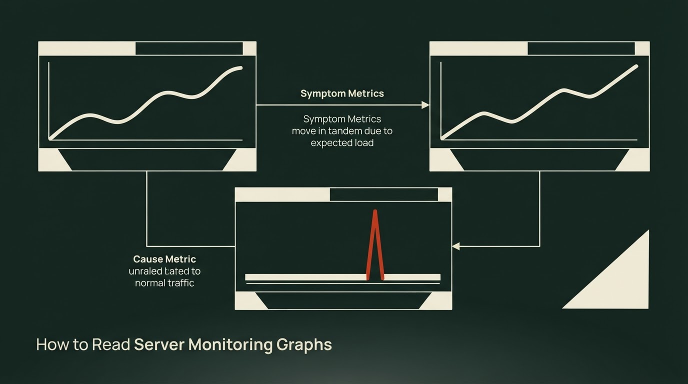
Percentiles answer “how slow were requests?” Host graphs answer “was the machine sick?” You need both.
A useful incident habit:
- See p99 (or a
histogram_fractionunder your SLO threshold) burn. - Ask whether CPU, memory pressure, disk, or saturation moved in the same window — using the literacy from the monitoring-graphs posts.
- Only then dive into code, GC, or lock contention.
If p99 spikes while host golden signals are flat, look at dependency latency, lock contention, or slow queries. If p99 spikes with swap-in or CPU saturation, fix the box or the footprint first.
This post stays focused on distribution math and PromQL correctness. The graphs posts stay focused on reading panels. Link them; do not paste one into the other.
Advantages and disadvantages of leading with percentiles
| Approach | Advantages | Disadvantages |
|---|---|---|
| Mean-only dashboards | Cheap; good for total work | Hides tails; bad UX SLI |
| p95/p99 from summaries | Accurate φ on one process | Cannot aggregate; inflexible window |
| Classic histograms | Aggregatable; flexible φ | Bucket planning; series cost |
| Native histograms | Aggregatable + resolution | Ecosystem maturity / scrape config; learn new APIs |
No fake case studies. No vendor crown.
External citations
- https://prometheus.io/docs/practices/histograms/
- https://prometheus.io/docs/concepts/metric_types/
- https://prometheus.io/docs/specs/native_histograms/
- https://prometheus.io/docs/prometheus/latest/querying/functions/#histogram_quantile
FAQ
Q1. Is p99 always better than p95 for SLOs?Not always. Higher percentiles are noisier and need more traffic for stable estimates. Pick φ from product risk; engineer bucket resolution to match.
Q2. Can I alert on mean and page on p99?Yes. Mean for capacity saturation; p99 (or a histogram fraction under a threshold) for UX SLOs.
Q3. Why did my p99 get worse after “fixing” histograms?Often coarser buckets or incorrect sum by (le). Verify bucket boundaries and that you sum before histogram_quantile.
Q4. Do percentiles include failed requests?Only if you observe them in the same histogram. Many teams separate success latency vs error count — be explicit on the panel.
Q5. Are Apdex and percentiles rivals?Apdex is a threshold-based satisfaction score; percentiles describe the distribution. Prometheus docs show Apdex via histogram_fraction. Use both carefully; do not equate them.
Q6. Should every microservice switch to native histograms tomorrow?Prefer them for new instrumentation when the stack supports protobuf/native scrape. Migrating classic → NHCB can be a bridge — validate in a staging scrape config first (optional next lab; this post’s numbers use classic buckets).
CTAs
Lab evidence
What I found running this
Local histogram lab 29 Sep 2026 IST — merged mean 57.3 ms, p50 20.6, p95 42.0, p99 1156.9; unweighted avg-of-p99 footgun 2253.6 ms vs merged truth. Method: Python/numpy + classic histogram_quantile (not Grafana). Seed 20260929.
Related links
Plate 90
How to Read Server Monitoring Graphs
A framework for turning dashboard noise into a diagnosis, based on the four golden signals and the symptom-versus-cause split — summarized from kciter's guide, with the author's hands-on verdict still to come.
22 Sept 2026
How to Read Server Monitoring Graphs
A framework for diagnosing dashboards: symptoms first, causes second, and why the average response time metric is lying to you.
10 Sept 2026
Plate 70
HTTP Keep-Alive vs Connection: close: Localhost Numbers and a Simulated-RTT Trap
30 Sept 2026