How to Read Server Monitoring Graphs
A framework for diagnosing dashboards: symptoms first, causes second, and why the average response time metric is lying to you.
6 min read
Most monitoring guides explain how to install dashboards; far fewer explain how to read them. That gap is the subject of a recent write-up, How to Read Server Monitoring Graphs, which lays out a framework for moving from a dashboard that looks off to identifying the actual problem.
The four signals, and which side they're on
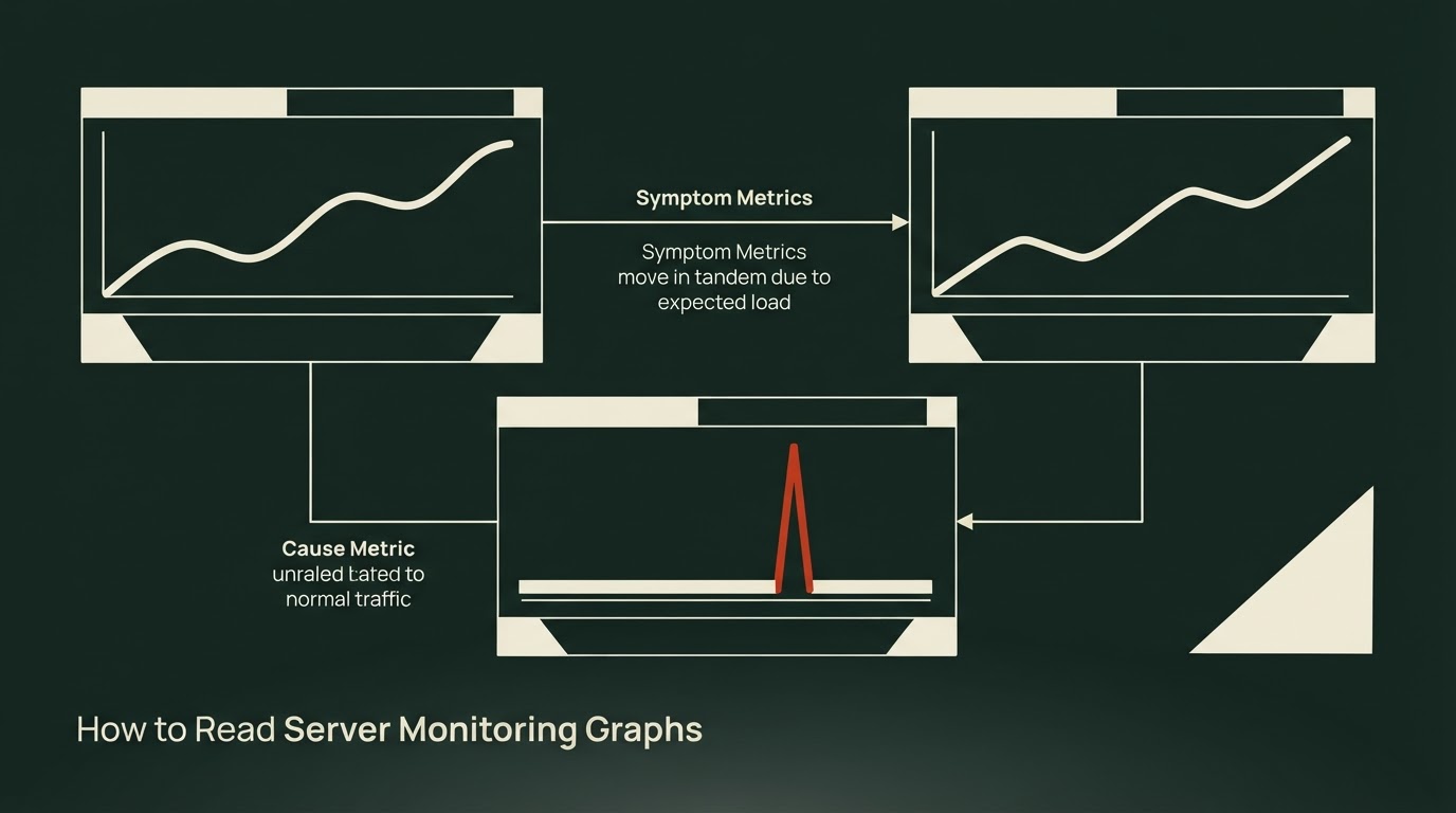
The source starts from Google SRE's four golden signals — traffic, latency, errors, saturation — and adds one more distinction that does most of the diagnostic work: every metric on a dashboard is either a symptom or a cause.
Latency and error rate are symptoms. They're what users actually experience, and when they rise, according to the source, "it is a problem, always." CPU, memory, thread pools, and connection pools sit on the cause side. As the source puts it, "CPU at 90% is not an immediate emergency if responses are fast, and CPU at 20% is a problem if responses are slow."
The rule that falls out of this: identify the symptom first, then narrow down the cause through the resource metrics. The same logic applies to alerting — the source notes that a momentary "CPU over 80%" alert often pages someone for nothing, while an "error rate exceeded" alert means someone is genuinely having a problem.
Here's the categorization as the source lays it out:
Traffic sets the baseline
Traffic isn't strictly a symptom, the source says, but it's the instrument you need to read latency and errors correctly. The first thing to learn about a traffic graph, before looking for anomalies, is its normal daily shape — most services draw close to the same curve every day. Without that baseline memorized, a metric sitting at half its usual level can look normal even though something is wrong.
The source describes specific anomaly shapes: a vertical drop in traffic doesn't mean the server went idle — it usually means requests are failing to arrive upstream, often at a load balancer, DNS, or gateway, while the servers behind it look deceptively calm. A vertical spike can mean a viral surge, crawler traffic, or an attack. Spikes that recur on a regular early-morning schedule are, per the source, "almost always batch jobs or cron."
Traffic also functions as a denominator. The source's point: 500 errors mean something completely different at a million requests per minute versus a thousand, so counts should generally be read as rates against traffic.
Why the average response time lies
The source poses a scenario: average response time has been steady at 100ms for days, but users keep complaining the app is slow. Its answer is that the average itself is the problem — "an average is a total divided by a count, so it erases the shape of the distribution." A server where every request takes about 100ms and one where most take 30ms but some take 900ms can produce an identical average.
That's the case the source makes for reading response time in percentiles — P50, P95, P99 — rather than averages. It argues the 1% at the tail (P99) isn't safe to ignore for two reasons stated in the source: first, at meaningful traffic volumes 1% is still a large absolute number of affected requests; second, in a modern service made of many API calls per screen, the more calls involved, the higher the odds that at least one lands in the tail. The source's own example: even if a single call avoids the tail with 99% probability, forty such calls only avoid it together with 67% probability — meaning roughly one user in three hits tail latency somewhere on the page. It also notes that heavy, long-time users tend to generate heavier queries and land in the tail disproportionately, so "P99 is quite possibly the response time your best customers are getting."
The source's guidance: P50 represents typical user experience; P95 or P99 should back alerts and performance targets, since early incident signs tend to show up in P99 first.
Reading error codes and error speed
On errors, the source's first move is to separate 4xx from 5xx before looking at magnitude. A 5xx is always the server's problem. A 4xx is technically a client error, but a surge in 400s or 401s right after a deploy more likely means a broken API contract — a version mismatch between client and server — than a sudden wave of bad clients.
The second axis is how fast failures happen. Per the source, timeout-driven failures fail slowly, holding a thread and connection for seconds before giving up, which creates error and saturation problems simultaneously. Failures like connection refusals from a dead dependency, or code bugs such as null references, fail immediately, returning a 5xx within milliseconds and freeing resources rather than exhausting them. Reading error rate alongside P99 tells you which kind you're facing: both rising together points to something slowing down and dying; error rate spiking while P99 stays flat points to something failing instantly.
The source flags a specific trap here: because instantly-failing requests either exit the latency distribution or register as fast millisecond samples, "the worse the incident gets, the better P99 can look." An incident dashboard showing peak error rate next to improved response times is, per the source, more likely survivorship bias than actual recovery.
Turning to causes: why CPU alone will mislead you
Once a symptom is confirmed, the source moves to narrowing down the cause — and states one overriding rule for this half of the process: "a resource metric read on its own will lie to you." Whether 90% CPU is a problem is answered by the response time graph, not the CPU graph itself.
The source walks through three CPU-plus-latency patterns:
- CPU tracks traffic, latency stays low — healthy.
- CPU idles at 20-30% while response time explodes — described as the pattern that confuses people most. Idle CPU with slow responses means threads are waiting, not computing — on a slow DB, a held lock, an exhausted connection pool, or a stalled external API. The fix is to stop looking at CPU and check I/O and pool metrics instead.
- CPU pinned flat at 100% — either traffic has outgrown capacity (if traffic rose with it, scale out) or code is spinning in a loop (if traffic is normal and only CPU spiked, suspect the code).
The source adds a container-specific wrinkle: in Kubernetes, a CPU limit gives a container a fixed quota per period, and once that quota is used up mid-period, the container is forcibly paused until the period resets. This is CPU throttling. If traffic and code haven't changed but the response time tail has grown, the source points to this setting as a possible cause.
The source material continues from here into bottleneck, backpressure, cache, and timeout patterns that only become visible when overlaying multiple graphs, plus guidance on applying all of it during an actual incident — that material isn't covered above. The author's own take on how well this framework holds up against real dashboards will follow in a later pass.
Sources
- How to Read Server Monitoring Graphs
For a server developer, monitoring is something like a lifeline. It has to be, because a server is a time bomb that can go off at any moment. With monitoring in place, you can narrow down the cause quickly when an incident happens, and sometimes catch a problem before it becomes one. Unfortunately, while there are plenty of guides on installing and building monitoring dashboards, there aren’t many on how to read those dashboards and diagnose problems with them. So a lot of developers feel a vag