Plate 90
How to Read Server Monitoring Graphs
A framework for turning dashboard noise into a diagnosis, based on the four golden signals and the symptom-versus-cause split — summarized from kciter's guide, with the author's hands-on verdict still to come.
Aditya Challa6 min read
Most monitoring guides stop at getting graphs onto a dashboard. They don't explain what to do once you're staring at ten panels during an incident. This guide is built specifically to fill that gap: how to read the graphs, not just how to build them.
The author's starting point is that every metric on a dashboard — no matter how sprawling the setup gets — falls into one of four buckets, borrowed from Google's SRE organization's four golden signals:
- Traffic: how much is coming in
- Latency: how long requests take
- Errors: how often requests fail
- Saturation: how full the server's resources are
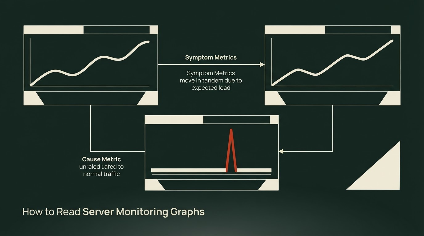
On top of that grouping, the guide draws a second, arguably more useful line: metrics are either symptoms or causes. Latency and error rate are symptoms — they're what users actually experience, and when they get worse, it is always a problem. Resource metrics (CPU, memory, thread pools, connection pools) are causes. CPU sitting at 90% isn't automatically bad if response times are fine, and CPU at 20% can still mean something is badly wrong if response times are terrible.
The rule that falls out of this: identify the symptom first, then use the cause-side metrics to narrow down why. The guide extends this to alerting too — alerts should be attached to symptoms, not raw resource thresholds, because a brief CPU spike alert wakes someone up over nothing while an error-rate alert means someone is actually affected.
Traffic as context, not just a symptom
Traffic itself isn't a symptom, but you need it to interpret every other metric. The guide's key point is that you have to know a service's normal shape before you can spot an anomaly — a metric can sit inside its "normal range" numerically and still be wrong if it's at half the level it should be at that time of day.
From there, the guide lists specific anomaly shapes:
- Traffic dropping vertically usually doesn't mean the server is idle — it means requests aren't arriving, often because something upstream (load balancer, DNS, gateway) is broken. If every metric on the server itself looks clean during an incident, that calm itself is the red flag.
- Traffic shooting up vertically can mean a viral surge, crawler traffic, or an attack.
- Regular spikes at a fixed time, especially early morning, are almost always batch jobs or cron.
The guide also stresses that traffic is a denominator: 500 errors mean something completely different at a million requests per minute versus a thousand. Any raw count — errors, slow queries, whatever — needs to be read as a rate against traffic.
Why averages lie about latency
The guide poses a direct scenario: average response time has been a stable 100ms for days, but users keep complaining the app is slow. Both can be true at once, because an average erases the shape of the distribution. A server where every request takes about 100ms and one where most take 30ms but some take 900ms can produce the identical average.
That's the argument for reading response time in percentiles instead — P50, P95, P99 — rather than the mean. The slow tail around P99 is called tail latency, and the guide gives two concrete reasons not to write it off as "just 1%":
- At scale, 1% is a lot of people. At 1,000 requests per second, that's ten requests hitting P99 every second, or roughly 860,000 requests a day.
- Modern pages fire dozens of API calls to render, and the odds of hitting the tail compound. Even if a single call avoids P99 with 99% probability, forty calls together only avoid it with 67% probability — meaning roughly one in three users hits tail latency somewhere on the page.
The guide also notes that tail-latency users aren't random: heavy, long-time users tend to generate heavier queries and land in the tail more often, so P99 may well be the experience of your best customers. The recommended framing: P50 represents typical user experience, while P95/P99 should anchor alerting and performance targets, since early signs of an incident tend to show up in P99 first.
Reading errors: which kind, and how fast
When an error rate graph jumps, the guide's advice is to ask which errors before how many. A 5xx is always the server's problem. A 4xx is nominally the client's fault by spec, but a surge of 400s or 401s right after a deploy more likely means the API contract broke — a version mismatch between client and server — not that every client suddenly misbehaved.
The second axis is speed of failure. Timeouts fail slowly: they hold a thread and a connection for seconds before giving up, so they show up as both an error problem and a saturation problem. Connection refusals or code bugs like null references fail immediately, returning a 5xx within milliseconds and freeing resources right away. Reading error rate alongside P99 together tells you which kind you're facing — rising together points to something slowing down and dying, while an error spike with flat P99 points to something failing instantly.
There's a related trap the guide calls out explicitly: requests that fail immediately leave the latency distribution (or blend in as millisecond-fast samples), so the worse an incident gets, the better P99 can look. If an incident's error rate is at its worst while response times look unusually good, that's survivorship bias, not recovery.
Narrowing down the cause: CPU can lie by itself
Once the symptom side flags a problem, the guide moves to cause-side metrics — CPU, memory, thread pools, connection pools — with one overriding principle: a resource metric read alone will mislead you. Whether CPU at 90% is a problem is answered by response time, not by the CPU graph in isolation.
The guide lays out three CPU-plus-latency patterns:
The idle-CPU-with-bad-latency case is flagged as the pattern that confuses people most, precisely because a quiet CPU graph looks like "nothing's wrong here" when the opposite is usually true.
The guide adds one container-specific wrinkle: in Kubernetes, when a CPU limit is set, a container can only use its allotted quota per period (100ms by default), and gets forcibly paused once that quota runs out — a mechanism called throttling. If traffic and code haven't changed but the response-time tail has grown, this container CPU-limit setting is worth checking before anything else.
The source material cuts off mid-section ("To see what..."), right as it appears to be moving into bottleneck, backpressure, cache, and timeout patterns that only show up when overlaying multiple graphs, plus guidance on when and how to apply all of this. The guide doesn't say what comes next in that section, so this summary stops where the material does.
Sources
- How to Read Server Monitoring Graphs
For a server developer, monitoring is something like a lifeline. It has to be, because a server is a time bomb that can go off at any moment. With monitoring in place, you can narrow down the cause quickly when an incident happens, and sometimes catch a problem before it becomes one. Unfortunately, while there are plenty of guides on installing and building monitoring dashboards, there aren’t many on how to read those dashboards and diagnose problems with them. So a lot of developers feel a vag
Related links
Plate 30
Why Your Average Latency Graph Is Lying (p50 / p95 / p99 Playbook)
Average latency hides tail pain. Learn when mean lies, how p50/p95/p99 work, why averaging quantiles fails, and how Prometheus histograms fix aggregation.
29 Sept 2026
How to Read Server Monitoring Graphs
A framework for diagnosing dashboards: symptoms first, causes second, and why the average response time metric is lying to you.
10 Sept 2026
Plate 70
HTTP Keep-Alive vs Connection: close: Localhost Numbers and a Simulated-RTT Trap
30 Sept 2026